Talking Portfolio: Episode Five
Behind the Painting: Colour Blind
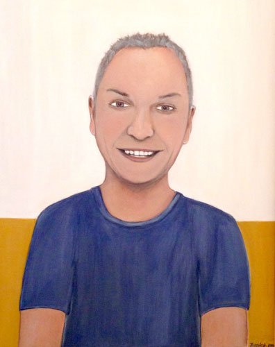
I am Erik is a study in colour. Because the man in the painting is unable to see the colour red, I wanted this piece to reflect the colours of his world as much as possible.
My main objective was to come up with a palette that could easily be seen by someone with red colour blindness (Protanopia).
At the same time, I also wanted to appeal to those able to see the full range of colour on the spectrum. It is for this reason that I then created a skin tone that emphasized yellow rather than red.
To do this, I had to find a way to reduce the warmth of the skin tone without compromising aesthetic appeal. In my Flipbook, you can see how I transform an image into a work of art.
Behind the Painting: Palette
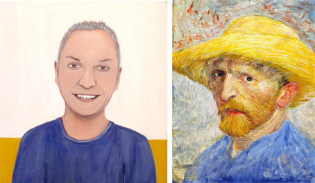
Red is a colour that I normally use to bring focus and warmth to a composition. But for someone who has Protanopia, this would appear as grey. In The Boxer, the boxing gloves are bright red and a clear focal point, and in Timeless, my grandmother is wearing a magenta coloured shirt.
For I am Erik, I chose colours which could be easily seen by someone who is red colour blind.
To create an appropriate colour blind palette, I used yellow for the background and blue for the shirt. It was because of the use of these colours in his work that led art experts to conclude that Vincent Van Gogh was colour blind.
Behind the Painting: Simulation
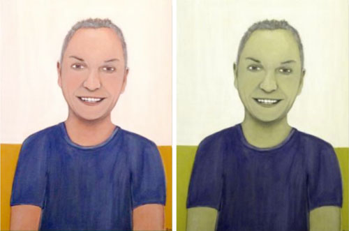
As an artist, I found it interesting to see the world through the eyes of someone with Protanopia.
Alongside, is a comparison of I am Erik. The left picture shows the original painting, while the right image has been placed through a colour blind generator.
This allowed me to see how I am Erik would be viewed by somebody who is red colour blind.
The colours of the painting when placed side by side, do not appear too dissimilar. In addition, the intensity of colour translates well when the red spectrum is removed by the generator. This makes it a painting that can be enjoyed no matter what colours an individual can see.
Behind the Painting: Version 2.0
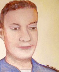
I also used a similar palette of yellow and blue to create a second painting of the same person.
This time I painted on a canvas panel, which was much smaller in size than the canvas for I am Erik.
A painting like this is perfect as a memento or as a gift for a loved one. It is so easy to commission your own and have yourself or someone you know become a work of art.